Plotly library is one of the best and most used libraries for data visualization like Seaborn or Matplotlib. This library is different from most of them since it can produce interactive data visualization instead of normal ones like you see in most libraries.
There is a company behind this plotly library located in Montreal, Canada, where you can use it directly on their website like any other data visualization software. Still, they’ve developed a python version to use on your machine.
1. Install The Libraries & IDE
You probably have an IDE you use for making your python code. Still, not all IDEs will perform the same when using different libraries, especially if you want to generate interactive data visualization using libraries like Plotly.
I will use Jupyter Notebook in this tutorial because it was created for this kind of visualization. It will be good to follow me and install it on your machine if you don’t already use it.
For creating an interactive data visualization, you will need to install many libraries in your Jupyter Notebook. Let’s install them:
!pip3 install plotly
!pip3 install cufflinks
!pip3 install pandas
!pip3 install chart-studio
!pip3 install numpy
I will explain what every library will be used in this tutorial. First, we will use plotly for making the data visualization. Cufflinks will link the plotly to pandas since plotly can’t understand the format that pandas use when importing the data.
When you need to read a CSV file, there is no better library than pandas for performing this action. We will use the chart-studio for making the data visualization interactive. Finally, generate random data using the numpy library.
2. Importing The Libraries
Let’s first start this tutorial by importing the libraries and packages we will use for making interactive data visualization:
import pandas as pd
import numpy as np
from plotly.offline import iplot
import plotly as py
import plotly.tools as tls
import cufflinks as cf
Run the cell above first to start using them. Then in the next cell, type this command:
py.offline.init_notebook_mode(connected=True)I’ve explained before that plotly isn’t just an open-source library like the other ones, but it is a company that made this library connect to their servers, make the plots there, and import them in this Notebook. So the previous command will let you use their library offline without depending on their servers. Let’s move to the following command:
cf.go_offline()The previous command will let cufflinks work offline also. Now, we’ve completed the importing section, and let’s move to create some visualizations.
3. Generate Random Data
To create a data visualization graph, you need some data to plot it. Let’s try first to make a small data sample to work with it using the numpy library:
# Generating Random Data
df = pd.DataFrame(np.random.randn(450, 3), columns = ["A", "B", "C"])

# Showing The Data
df.head()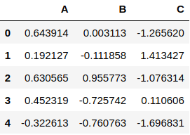
The first line of the above code will generate random data using the np.random.randn() function has 450 rows with 3 columns, and the name of the columns are A, B, C. As you can see, we’ve set that in the argument columns.
Then, we convert the data using the panda library and the .DataFrame() function. You need to store them in a variable which is df (Stands for Data Frame) in this example.
Later, you can see the data using the df.head() function. By default, the .head() function shows the first five rows, but you can specify the number of rows you want to see. You can make sure that the data is 450×3 using this simple command:
# Getting The Data Shape
df.shape
4. Line Plot
Plotting the data in Plotly is easy. We will need to use the data we’ve generated before to make a simple plot:
# Plotting The Data
df.iplot()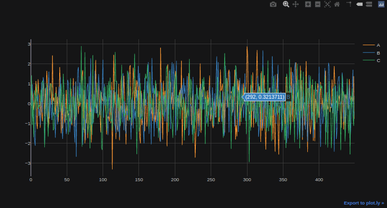
When you hover over the plot, you can see it is interactive and shows the values of every point you hover over it. You can also see in the top right corner of this graph some of the tools you can use like zoom in & out, taking a picture of the chart, and many other tools, to name a few.
5. Scatter Plot
There are many other plots that plotly can do and one of them called scatter plot, which will represent the values as points in the graph:
# Generating a Scatter Plot
df.iplot(mode = "markers")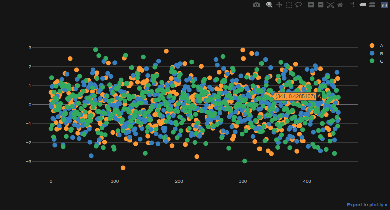
We’ve used the same function as before, which is .iplot() for making this visualization, but we specify the “mode” parameters and set it to “markers” to show dots. You notice that the dots are large a little bit, and the graph does not seem good, so let’s change the size of the dots:
# Generating a Scatter Plot
df.iplot(mode = "markers", size = 7)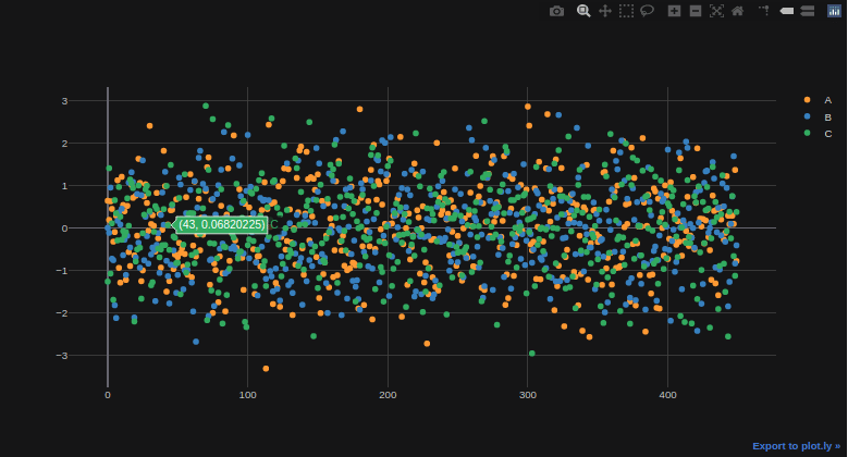
You can decrease or increase the size of the points of the markers using the size parameter and change its value.
6. Histogram
The histogram is very popular among data science and data visualization charts and is an approximate presentation of the distribution of the numerical data. Let’s see a simple example of creating a histogram using the plotly library:
# Generating a Histogram
df.iplot(kind = "histogram")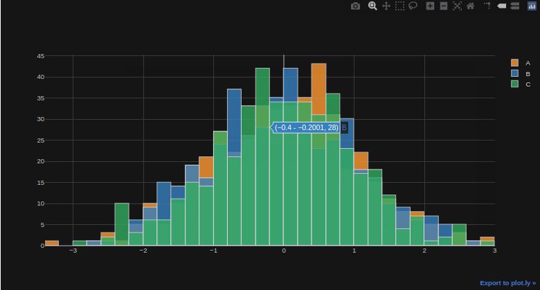
Conclusion
Plotly is one of the fabulous tools for making interactive data visualization, but it may seem a little bit hard and require a lot of other packages and libraries to work with. Visit the official documentation to understand more about plotly.