In the previous article Seaborn For Data Visualization -Part 1, we’ve looked at how you can first install the seaborn library.
Then we’ve seen how you can use the built-in dataset of the seaborn library and create different data visualizations plots such as distribution plot, joint plot, kde plot, and pair plot. So if you didn’t see the previous tutorial, I recommend checking it out and completing this services of seaborn for data visualization.
1. Pair Plot
At the end of the last tutorial, we’ve learned how we can create a pair plot, but you can also customize it much more for better visualization. First, let’s import the seaborn library and load the dataset:
import seaborn as sns #Import seaborn Library
tips = sns.load_dataset("tips") #Load the dataset
tips.head() #Show the dataset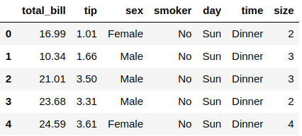
The tips dataset has been collected in a few months showing people who made a tip. It contains 244 rows and seven columns representing the person’s sex, tip amount, total bill amount, meal (Dinner or Lunch), and more. So let’s see how to create a pair plot with some customizations:
sns.pairplot(tips, hue="time") #Pair plot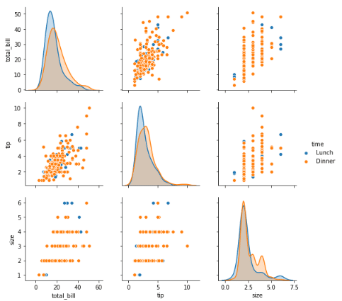
You can see that we’ve created this pair plot using the .pairplot() function from seaborn, and you need to pass in the dataset you’ve imported, which was the tips dataset. We’ve given the argument hue, which should be categorical data, and the whole chart will be categories based on that data. You can also pass the argument pallet to change the chart color:
sns.pairplot(tips, hue="time", palette="magma") #Pair plot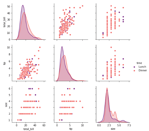
As you can see after choosing the magma palette, the chart’s color has been changed. You can choose many colors, not just this one in the above example. Feel free to choose the best color that suits your visualization.
2. Rug Plot
Not used many of these plots, but it can be an excellent option to visualize the distribution of your data in your dataset. It will plot a single column of data points as sticks in the X-axis:
sns.rugplot(tips["tip"]) #Rug plot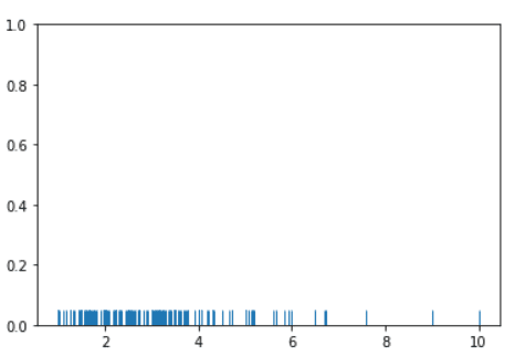
You can see the dense of the sticks is between the numbers two and four, where the same values are common. We’ve used the .rugplot() function to make this visualization and pass the dataset you want to use.
3. Style The Plots
The nice thing about Seabron is that you can set styling for your plots without the need to keep passing the same argument in every plot. You can do this using this command:
sns.set_style("dark") #Change styleThere are only five styles you can choose which are “white”, “dark”, “whitegrid”, “darkgrid”, or “ticks”. So let’s try this style and see how it looks on the Rug plot:
sns.set_style("dark") #Change style
sns.rugplot(tips["tip"]) #Rug plot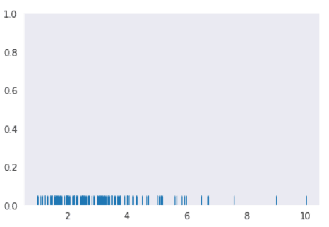
You can see that the color has been changed of the plot. Feel free to experiment with the other styling options. You can also change the plot size using the matplotlib library. If it is not installed on your Jupyter Notebook, then you need first to install it using this command:
!pip3 install matplotlibAfter it is installed successfully, you need first to import it. Then you can change the plot size using this command:
import matplotlib.pyplot as plt #Import the matplotlib library
plt.figure(figsize=(4, 4)) #Change the plot
sns.rugplot(tips["tip"]) #Rug plot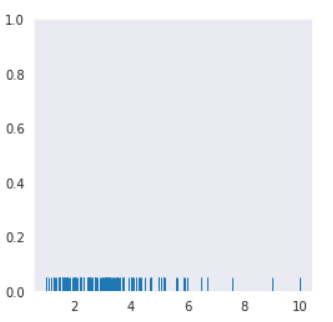
You can see that the plot is small than the previous one. We’ve used the .figure() function from the matplotlib library to change the size of this plot, and you can set the width & height of the plot inside the figsize argument.
4. Bar Plot
Now let’s move to the categorical plots, and the very first one we learn is the bar plot which is one of the most used plots in data visualization. It represents categorical data with rectangular bars. Let’s see an example:
sns.barplot(x="sex", y="tip", data=tips) #Bar plot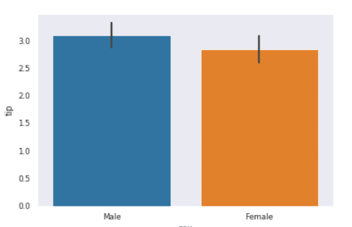
From the bar plot, you can see that the male is giving more tips than females. We’ve achieved this plot using the .barplot() function, and you need to pass the X-axis values, which is the “sex” column in this case, and the Y-axis, which is the tip column.
The mean will aggregate this data by default, but you can change that by using the “estimator” argument. Before we use this argument, you need to install the Numpy library, which is used in python for mathematical calculation. Let’s first install this library:
!pip3 install numpyLet’s use now another estimation for this bar plot:
import numpy as np #Import numpy library
sns.barplot(x="sex", y="tip", data=tips, estimator=np.median) #Bar plot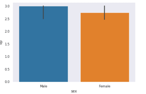
You can see that in the estimator argument, we’ve passed the “np.median” value which will change the default calculation in the bar plot. You can also use another value which will plot this chart according to the standard deviation:
import numpy as np #Import numpy library
sns.barplot(x="sex", y="tip", data=tips, estimator=np.std) #Bar plot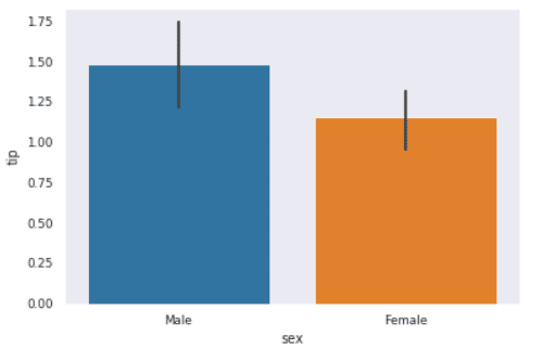
We’ve used the “np.std” to change the calculation to standard deviation but let’s see also another one based on the variance:
import numpy as np #Import numpy library
sns.barplot(x="sex", y="tip", data=tips, estimator=np.var) #Bar plot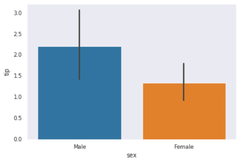
You can choose many other values to plot based on that mathematical calculation, but I will stop only in these few examples since there are endless options to cover.
Conclusion
Thanks for reading! The seaborn library has more plots and customizations than what we’ve covered in these two articles. Still, I will be posting more about this great library in the following order.