In the previous tutorial Seaborn For Data Visualization- Part 3, We’ve seen how to use the seaborn library to import the data. Then we have used it to create many different plots, such as count plot box plot adding a category to the plot using the hue.
We have also seen how to create a violin plot that combines box and KDE plots, the strip plot to represent data points based on the points category as a scatter plot, and much more. If you didn’t see the previous one, I recommend checking this whole series of seaborn for data visualization.
1. Context
Many data scientists and people who use data visualization in their work prefer seaborn over many other data visualization libraries and tools because of its endless customization options. One of the things you can perform is changing the palette, which will change the plot color. Let’s first import the data and start making some visualizations:
import seaborn as sns #Import seaborn library
tips = sns.load_dataset("tips") #Load the dataset
tips.head() #Show the dataset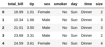
A worker at a random restaurant collects this dataset called tips and essentially shows people bills for their meal, their tips after every meal, the people’s gender, and any other data.
We will use this simple dataset with 244 rows and seven columns for this tutorial. Let’s create a strip plot as an example and apply some customization to it:
sns.set_context("talk") #Change the context
sns.stripplot(x="day", y="total_bill", data=tips, hue="sex") #Strip plot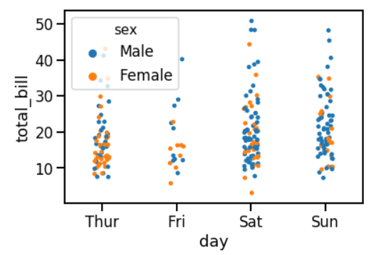
We could change the look of this stip plot using the .set_context() and pass the type you want to use. There are a lot of pallets to choose from, but we will use the “talk” for this example.
The .stripplot() function is for creating the strip plot and passing the X & Y values, which are the “day” and “tottal_bill” respectively, and adding a category to separate the male ad female using the hue attribute.
2. Plot Size
You can also see that the plot is small. Since the data are stacked on each other, the legend is hiding some of these points. Let’s first install the matplotlib library that will be used to change the plot size:
!pip3 install matplotlib #Install matplotlibAfter the library is successfully installed, you can use this command below to change its size:
import matplotlib.pyplot as plt #Import the matplotlib
plt.figure(figsize=(8, 8)) #Change the plot size
sns.set_context("notebook") #Change the context
sns.stripplot(x="day", y="total_bill", data=tips, hue="sex") #Strip plot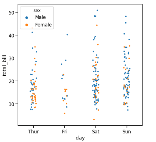
The plot looks better since the legend is at the top left, and the data points look better. We could achieve this by using the .figure() function and setting the width and height inside that function.
3. Palette
Seaborn library relies on many other data visualization and mathematical libraries to deliver plots such as matplotlib, pandas, and numpy.
Changing the palette (color) of the plots is easy, and the values are the same as matplotlib colormaps. Let’s see an example to understand about changing colors in seaborn:
plt.figure(figsize=(8, 8)) #Change the plot size
sns.set_context("talk") #Change the context
sns.stripplot(x="day", y="total_bill", data=tips, hue="sex", palette="plasma") #Strip plot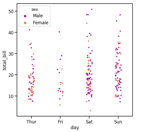
You can see that the colors of the data points have been changed using the pallet argument and pass in the color you want. The example used the magma color, but you can choose any other color which is available on the matplotlib colormaps website, such as Plasma, Viridis, and more, to name a few.
4. Legend
The legend always shows at the top left, but sometimes it covers some data in this place, so you can change its location using matplotlib library:
plt.figure(figsize=(8, 8)) #Change the plot size
sns.set_context("talk") #Change the context
sns.stripplot(x="day", y="total_bill", data=tips, hue="sex", palette="plasma") #Strip plot
plt.legend(loc=1) #Change the legend location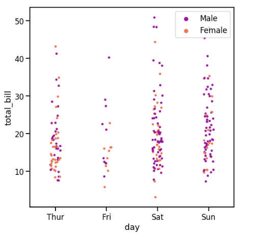
You can see by using the .legend() from the matplotlib library to change the location of the legend to the upper right. It is also possible to change it to another location. You can use the available values to change the legend location from the documentation of the matplotlib legend.
5. Heatmap
Heatmap is used a lot among data visualizations which is a graphical representation of the data by using colors to visualize the different values of the matrix. Before we create a heatmap, we need to change something in the dataset:
You can see that rows of the first column contain numbers between 0 to 243, which is the number of the rows in the dataset, but you have to change that in a matrix format variable:
tips_mx = tips.corr() #change the data
tips_mx #Show the data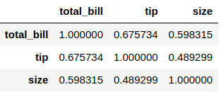
Let’s now plot this new data as a heatmap using the seaborn library:
sns.heatmap(tips_mx, annot=True, cmap="winter") #Heatmap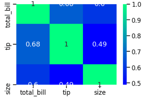
You can create the heatmap plot using the .heatmap() function and specify the data you want to plot, then set annot argument to True so you can see the numbers in the center of the boxes, and you can specify the color of the plot, which is winter in this case.
Conclusion
Thanks for reading! Seaborn library can do more data visualization plots and customizations than almost all the tools and libraries available on the internet. Getting the skills of using it will make you better at extracting insight from your data.