Data visualization is the science of converting the raw data you get from different resources to various plots. It is an art and skill you need to master to give a meaningful insight for your employee to drive better decisions. This article will explain using the Seaborn library for producing data visualizations in many different plots and you will love using its style if creating charts.
1. Installing The Environment
Every developer should use an IDE for coding programs using any programming language, and python is one of them. You can use any IDE you love, but I will use Jupyter Notebook for making data visualization using Seaborn for this tutorial.
2. Installing The Libraries
Before you start making the visualization using the seaborn library, you need to install this package which is Seaborn library, using the pip3 command on Jupyter Notebook:
!pip3 install seaborn #Installing the seaborn libraryAfter you see the successful installing message that tells you everything is working fine, we will make some data visualization using seaborn.
3. Seaborn Built-in Data
When you want to create data visualization charts, you need to have some dataset to plot. People who start learning this field can use the Numpy library for making some random data or grabbing the data as a CSV from websites such as Github & Kaggle and importing them using Pandas library.
The coll thing in Seaborn that developers implement is the built-in dataset you use directly in your code. If you want to know that dataset is available in Seaborn, then write this command on Jupyter Notebook:
import seaborn as sns #Import the library
print(sns.get_dataset_names()) #Printing the available dataset
You can see there are many available datasets in the seaborn library. We will use one of them called car_crashes. Let’s see an example of how to import this dataset and use them:
crash = sns.load_dataset("car_crashes") #Import the dataset
crash.head() #Show the dataset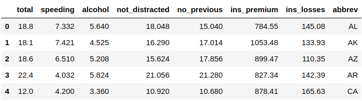
We’ve used the function .load_dataset() to import the data you want to use, which is “car_crashes” in this example. The following line shows the data and the function .head() to show the first five rows of your data. Remember that in the python programming language, we start counting from zero, not one.
If you want to see more data than this sample of five rows, then you can specify the rows number you would like to see in the .head() function as you see below, which we will show ten rows of this data:
crash = sns.load_dataset("car_crashes") #Import the dataset
crash.head(10) #Show the dataset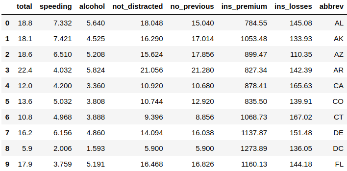
4. Distribution Plot
Seaborn has endless plots that you can make out of your data. It is even impossible to cover them in our article, so we will start making the most used and famous one in this tutorial. Let’s start by making a distribution plot that will represent the general distribution of the continuous data variables:
sns.distplot(crash["not_distracted"]) #Distribution plot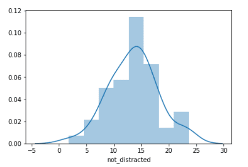
We’ve used the function .distplot() to make this distribution plot, and you need to pass that data you’ve imported at the first time and specify the column you are interested in plotting which was “not_distracted” in the above example. The line you see in the plot is called the Kernel Density Estimation, and you get rid of it by using the argument kde and setting it to False:
sns.distplot(crash["not_distracted"], kde=False) #Distribution plot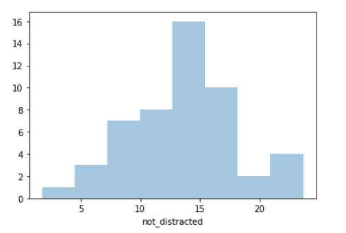
5. Joint Plot
Another plot used a lot is called the joint plot, which is used to visualize and analyze the relationship between two variables. Let’s create one using seaborn with only one command:
sns.jointplot(x="speeding", y="alcohol", data=crash) #Joint Plot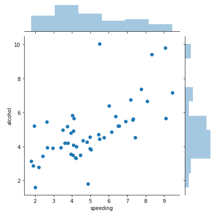
We used the .jointplot() function to make this plot, you need to specify the X-axis data, which was the “speeding” variable. The Y-axis is the “alcohol” so basically measuring the speed of people compared to the alcohol in their body. Finally, you need to specify the data you are using, “crash” in this case.
You can create a regression line to better visualize the data on this joint plot by using the argument “kind” and setting it to “reg” which stands for regression:
sns.jointplot(x="speeding", y="alcohol", data=crash, kind="reg") #Joint Plot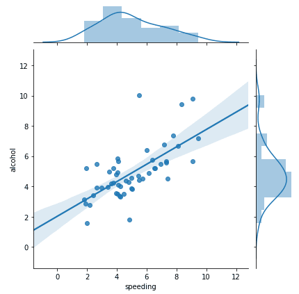
We can also change this distribution visualization to something like KDE, which stands for Kernel Density Estimation:
sns.jointplot(x="speeding", y="alcohol", data=crash, kind="kde") #Joint Plot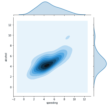
6. KDE Plot
You can also create a KDE (Kernel Density Estimation) plot. It represents your data using a continuous probability density curve in one or even more dimensions. Let’s see an example:
sns.kdeplot(crash["alcohol"]) #KDE Plot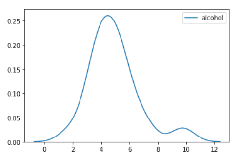
You can see that you will use the .kdeplot() function to plot the KDE plot. You need to specify the data you will use and the column you are interested in visualizing, which is “alcohol”.
7. Pair Plot
Another handy plot is called the pair plot. It will visualize the relationships between each variable in your entire dataset. Let’s see an example of this plot:
sns.pairplot(crash) #Pair Plot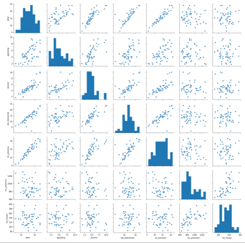
When you execute the command on Jupyter Notebook, it will take you some time to see the plot since it will visualize the relationship between every variable in your data.
You can see that we used the .pairplot() function to plot the dataset. You need to pass in the data you’ve imported before, which is “crash” in this tutorial.
Conclusion
Thanks for reading! There are many tools for data visualization available on the internet such as Tableau, Power BI, Excel, Plotly, and more. Most of them are good but learning a programming language such as python and making data visualization using one of its libraries such as Seaborn will give you more flexibility over your charts.