In the previous tutorial Seaborn For Data Visualization -Part 2, we’ve looked at some intermediate use of the Seaborn. The article shows how you can create a pair plot with some customizations to change the looks, such as adding style, changing the plot dimension, and making it better to understand and deliver the insight.
We also saw how to create many other plots, such as rug plots and bar plots. So if you didn’t see the previous tutorial or are still not comfortable using seaborn, I recommend checking out the previous one and then back to this tutorial.
1. Count Plot
Count plot is similar to the bar plot or a histogram, which will calculate the occurrence number of a particular item in your dataset based on a specific type of category. Let’s first import the seaborn library and the dataset:
import seaborn as sns #Import seaborn library
tips = sns.load_dataset("tips") #Load the dataset
tips.head() #Show the dataset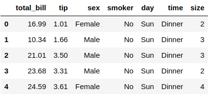
Someone in the restaurant collects this dataset, and it shows people bills for their meal, their tips, the people’s gender, and more. This is just a simple dataset that has 244 rows and seven columns. Let’s create the count plot using Seaborn:
sns.countplot(x="sex", data=tips) #Count plot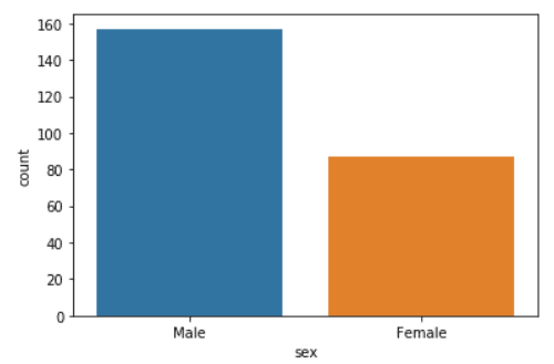
You can see that the number of male in the dataset are a lot more than the number of females. We’ve used the .countplot() function to plot this data, and you will need to specify two variables which are the X-axis dataset that is the “sex” and the data you’ve imported. Let’s apply the same plot on the time column:
sns.countplot(x="time", data=tips) #Count plot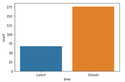
From the count plot above, you can see that the number of Dinner in the dataset are a lot more than the Lunch!
2. Box Plot
Box plot is used a lot in data visualization, and it is an excellent method to display the distribution of the data based on its quartiles. Let me show you an example:
sns.boxplot(x="day", y="total_bill", data=tips, hue="sex") #Box plot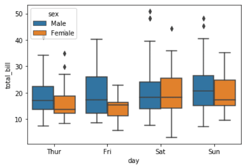
The box plot is a bit complex to understand, and it needs some time to learn, but I will explain some of it.
The line inside every rectangle is the median, and the box will be extended on standard deviation from the median (The line that crosses the rectangles). The points (Lozenge) are outliers in the dataset.
You can see that we’ve used the .boxplot() function and passed the X & Y variables, which are the days and the total_bill. You need to specify the data you’ve imported, the tips dataset. Finally, we use the hue to add categories which will let us separate them based on the people’s gender.
3. Violin Plot
Violin plot combines the box plot and KDE plot in one graph. This plot is always used to visualize the distribution of numerical data in your dataset. Let me show you an example:
sns.violinplot(x="day", y="total_bill", data=tips, hue="sex") #Violin plot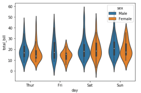
The violin plot used the KDE plot to estimate the data points of your dataset. You can notice that we’ve used the .violinplot() function to plot this graph and pass in the data, which is the X & Y values that is the day and the total_bill and where this data is coming from, which is the tips dataset. We’ve added the hue as sex to separate the people’s gender and add a category.
4. Strip Plot
Strip plot is used to draw the scatter plot representing all the data points based on the category. Let me show you an example:
sns.stripplot(x="day", y="total_bill", data=tips) #Strip plot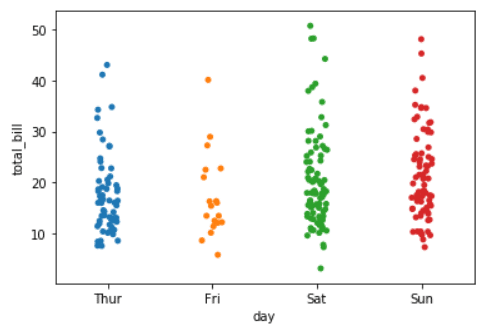
The plot shows you the points, which is the total bill categorized by the day. You can see we’ve used the .stripplot() function to create this plot and pass the data, which is the X & Y values that is the day and the total_bill in this case and where this data is coming from, which is the tips dataset. Let’s separate the data and add categories using the hue argument:
sns.stripplot(x="day", y="total_bill", data=tips, hue="sex") #Strip plot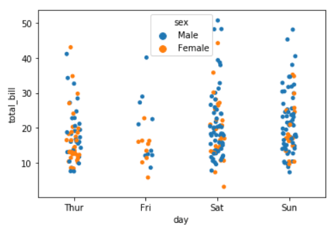
You can notice that the data is separated by using the hue argument and based on the people’s gender. You may notice that the points are stacked, and you can fix that using the jitter argument:
sns.stripplot(x="day", y="total_bill", data=tips, jitter=True, hue="sex") #Strip plot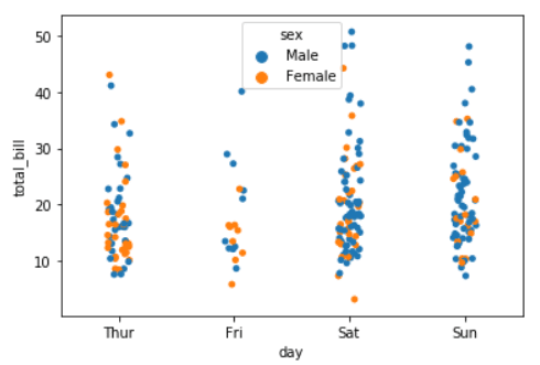
Even after using the jitter argument to spread the data out, it still stacked on each other, so we can use an argument provided by the seaborn library to separate the male and female data from each other:
sns.stripplot(x="day", y="total_bill", data=tips, jitter=True, hue="sex", dodge=True) #Strip plot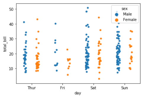
Now the strip plot looks a lot better, and you can see every person’s gender-separated from each other, which gives a clear view of your data.
5. Swarm Plot
The Swarm plot is similar to the scatter and strip plots but with non-overlapping points. It is similar to the violin plot but with points. Let’s see how it looks with an example:
sns.swarmplot(x="day", y="total_bill", data=tips) #Swarm plot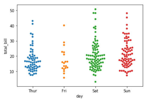
You can see that it is very similar to the violin plot but with distributed points. We achieved this plot using the .swarmplot() function and passed the data, which is the X & Y values that are the day and the total_bill in this example and where this data is coming from, which is the tips dataset.
Conclusion
Thanks for reading! This is an advanced level of the seaborn library and how to make data visualization using python. If you didn’t check the previous tutorial of seaborn, then I recommend checking the first and second parts of this series.